
Tables
Tables display time-stamped historical records of tag values in a structured grid — useful for shift reports, audit logs, and data troubleshooting.
On this page
A Table is a data log viewer. It retrieves historical records of tag values from the database and displays them as a time-stamped grid, with each row representing a recorded sample and each column representing a tag or a calculated field.
Tables are the right tool when you need to see exact values with their timestamps rather than a graphical trend. Common uses include:
Shift reports — review all key process values logged during an 8-hour shift.
Audit logs — export or display a record of tag values for quality, compliance, or maintenance records.
Data troubleshooting — spot missing samples, out-of-range values, or unexpected spikes in raw tabular form, which can be easier to diagnose than on a chart.
Creating a table
In the left sidebar (Project mode), expand Visuals → Tables. Click once on Tables to select it and activate the + button in the sidebar toolbar.
Click +. Enter a descriptive name such as Daily Production Log or Energy Audit Table. Click Save. The table appears in the tree.
Double-click the table name. The table editor opens in a new tab.
Add the tags you want as columns. Set the default time range (last shift, last 24 hours, or a custom window). Configure column labels, units, number formatting, and sort order. The table populates with historical records matching the current time range.
Table toolbar actions
When a Tables tab is active in the editor, the toolbar provides:
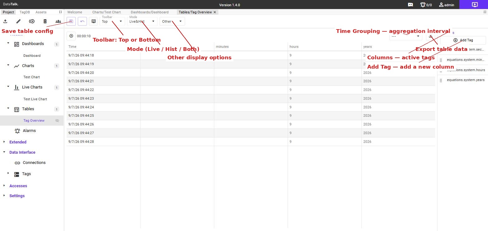
Save table config (floppy disk icon) — saves the current table configuration including columns, time range, and display settings.
Toolbar — dropdown that sets where the table’s own control bar (time picker, export buttons) appears when the table is viewed: Top or Bottom.
Mode — dropdown that determines which data the table loads: Live&Hist shows both live streaming and historical records, Live shows only the current real-time stream, Hist shows only historical database records.
Other display options — additional settings for how rows and values are displayed in the table.
Time Grouping — dropdown in the top-right corner of the table area. Sets the aggregation interval applied to each column. Instead of showing every raw sample, the table groups records into time buckets (for example, 15 minutes, 1 hour, 1 shift) and calculates an aggregate — sum, average, min, or max — per bucket. The interval is configured per tag (column), so one column can aggregate by 15 minutes while another shows raw values.
Export (download icon) — exports the current table contents as a file (CSV or similar) for use in external reports or spreadsheets.
Columns panel — the right-side panel lists all tags currently assigned as columns. Each entry shows the tag path. Drag entries to reorder columns.
Add Tag — opens a tag picker to add a new column to the table. Each added tag appears as a new column with its own Time Grouping setting.
Key settings
Tags / Columns — each selected tag becomes a column in the table. Assign a human-readable column header and unit label to each.
Time range — the default window of records to display. Operators can typically adjust this interactively in view mode using date/time pickers.
Sort order — newest records first (descending) or oldest first (ascending).
Filtering — optionally restrict rows to records where a tag value meets a condition (for example, show only rows where a status tag equals a specific code).
Typical Time Grouping use cases:
| Interval | Aggregate | Example |
|---|---|---|
| 15 minutes | Sum | Quarter-hour energy consumption (kWh) for billing or peak-load analysis |
| 1 hour | Sum / Avg | Hourly production count or average line pressure |
| 8 hours | Sum | Shift output — total pieces produced or total flow volume per shift |
| 1 day | Sum / Max | Daily energy totals or peak demand per day |
Time grouping is what turns a raw sample log into a production or energy report. The same data can also be fed into a Chart grouped by the same interval — for example, a bar chart of hourly production or a 15-minute energy consumption profile.
Placing tables on dashboards and in documents
A table can be dragged from the Project tree onto a Dashboard canvas like any other visual component. This lets operators view a live-updating data log alongside charts and gauges on the same screen.
Tables can also be embedded in Documents (under Extended), where they appear as a data grid within a structured page — useful for formatted reports that combine text, images, and tabular data.
When placed on a dashboard in view mode, a table refreshes automatically at a configured interval. New rows that fall within the selected time range appear without requiring a manual page reload.