
Assets — Component Editor
Build custom visual components from scratch using the SVG-based Component Editor. Define variables, animate properties from live tag data, and reuse components across dashboards.
On this page
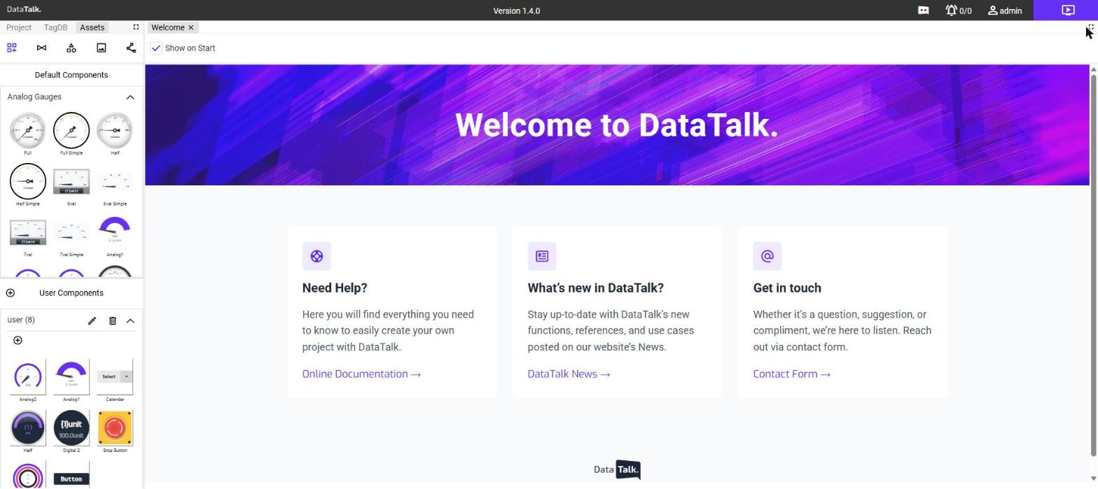
The Component Editor is a vector drawing tool built into DataTalk. It lets you design custom dashboard components from scratch — dial gauges, indicator lights, process diagrams, or any other industrial visual — and then wire their properties to live tag data using variables and animation bindings.
Components you create appear in the User Components section of the Assets panel and can be dragged onto any dashboard just like built-in components.
Opening the Component Editor
Click the Assets tab at the top of the left sidebar.
Click the third filter icon at the top of the Assets panel (Component Editor). The panel shows two sections: Default Components and User Components.
To create a new component, click + in the User Components toolbar and enter a name. To edit an existing one, double-click its thumbnail — a single click only selects it.
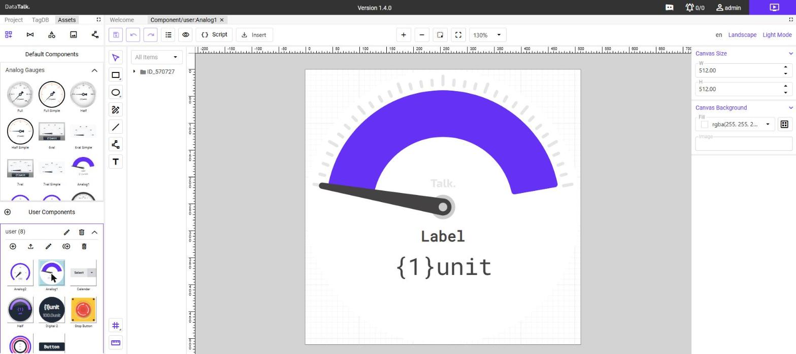
The component opens in a full-screen editing canvas with a layer tree on the left, a drawing toolbar below the rulers, and a properties panel on the right.
The editor interface
| Area | Purpose |
|---|---|
| Canvas | The drawing surface. Rulers and guides help with alignment. |
| Layer tree (left panel) | All elements in the component as a nested tree. Click to select; drag to reorder. |
| Drawing toolbar | Tools to create elements: Select, Rectangle, Circle, Edit path, Line, Path, Text. |
| Properties panel (right) | All settings for the selected element — position, color, variable bindings, and more. |
| Insert menu | Import external SVG files into the component. |
Canvas settings
Click an empty area of the canvas (or select the root group in the layer tree) to access canvas-level settings:
- W / H — the component’s default size in pixels. This is the size it is drawn at when dropped onto a dashboard canvas; the user can resize it afterwards.
- Background — fill color and optional background image for the canvas.
Element types
Use the drawing toolbar to add elements. Each element type has its own shape-specific properties in addition to the common properties described below.
Rectangle
A filled and/or stroked rectangular shape. Used for frames, backgrounds, status bars, and other rectilinear graphics. Supports a Corner Radius property to create rounded corners.
Circle
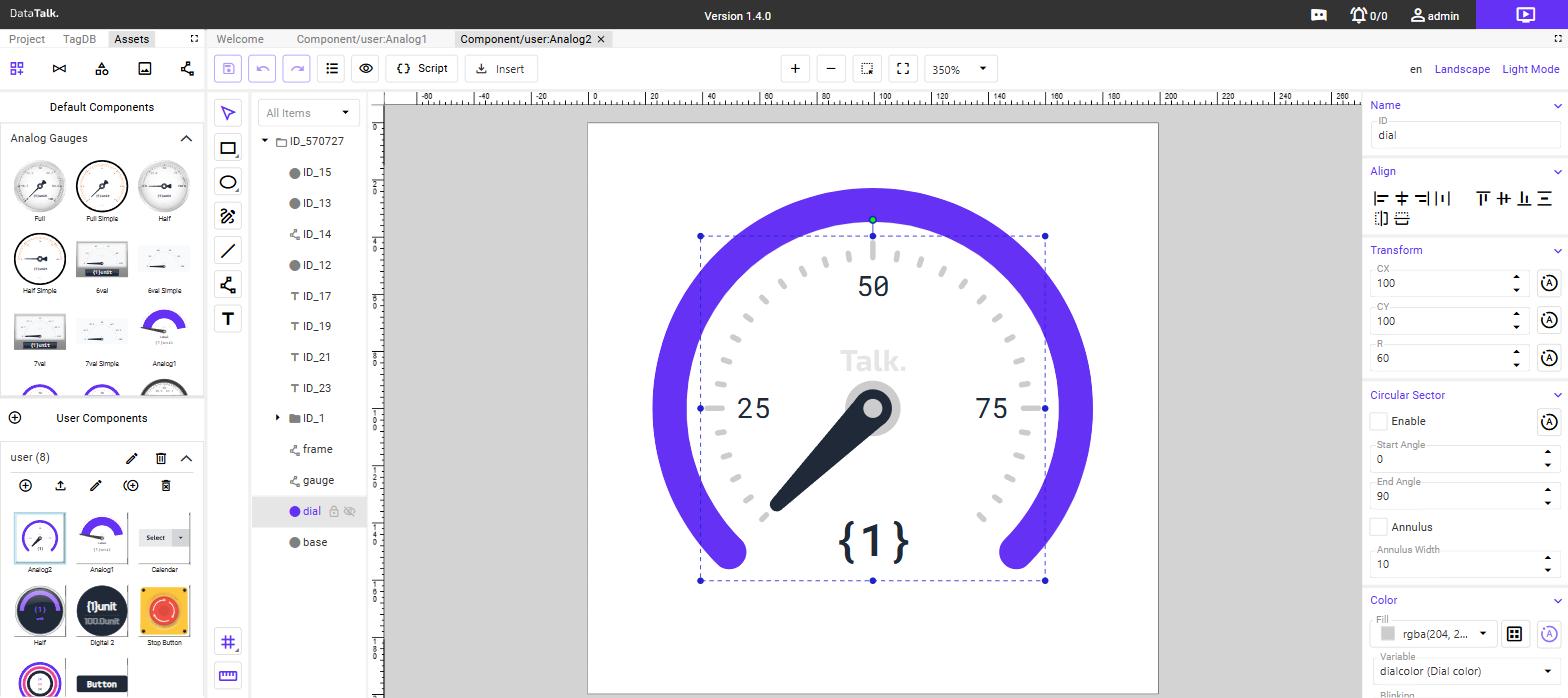
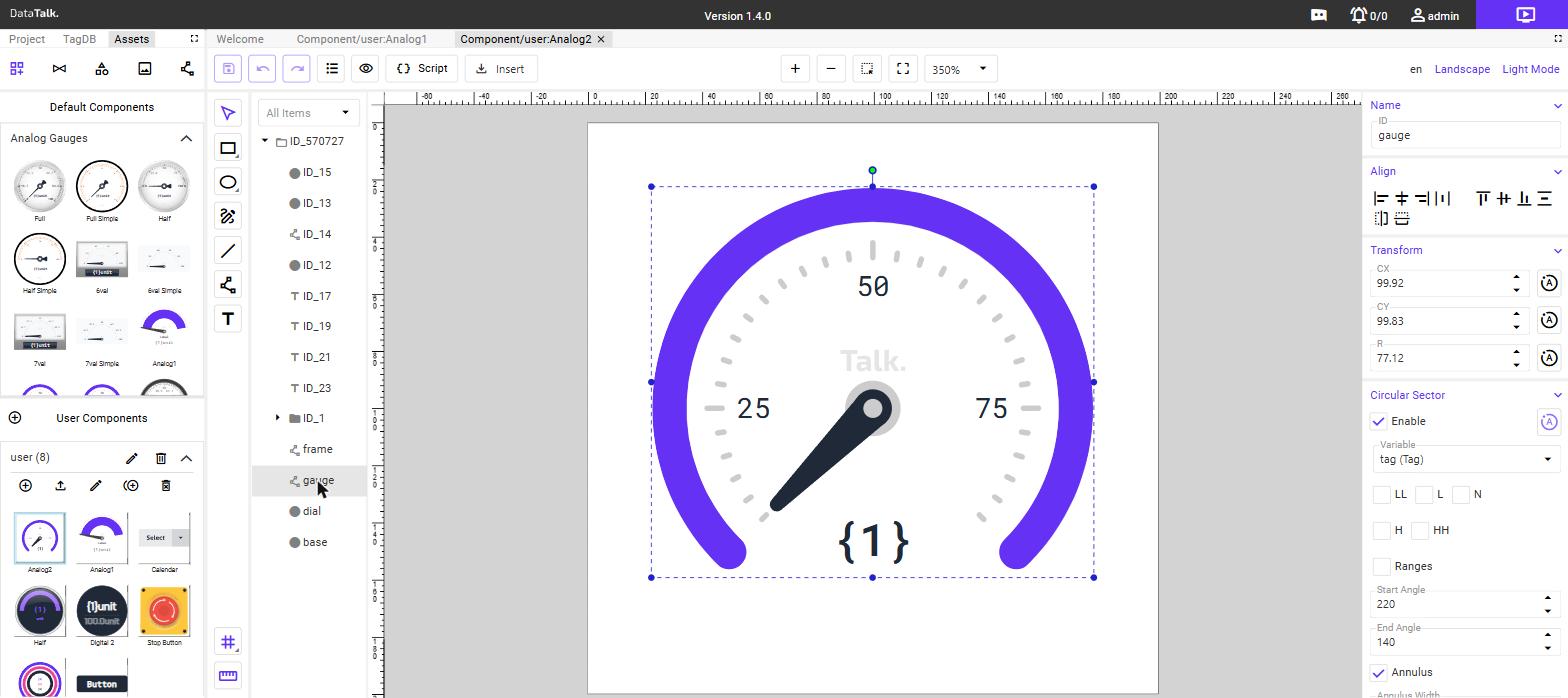
A circle or ellipse. When Circular Sector is enabled in the properties panel, the circle becomes an arc or ring segment — useful for sweep-gauge backgrounds and progress arcs.
| Circular Sector property | Effect |
|---|---|
| Start Angle | The angle (degrees) where the arc begins (0 = right, 90 = bottom) |
| End Angle | The angle where the arc ends |
| Annulus | Enable to convert the filled sector into a ring (hollow centre) |
| Annulus Width | Width of the ring in pixels |
Path
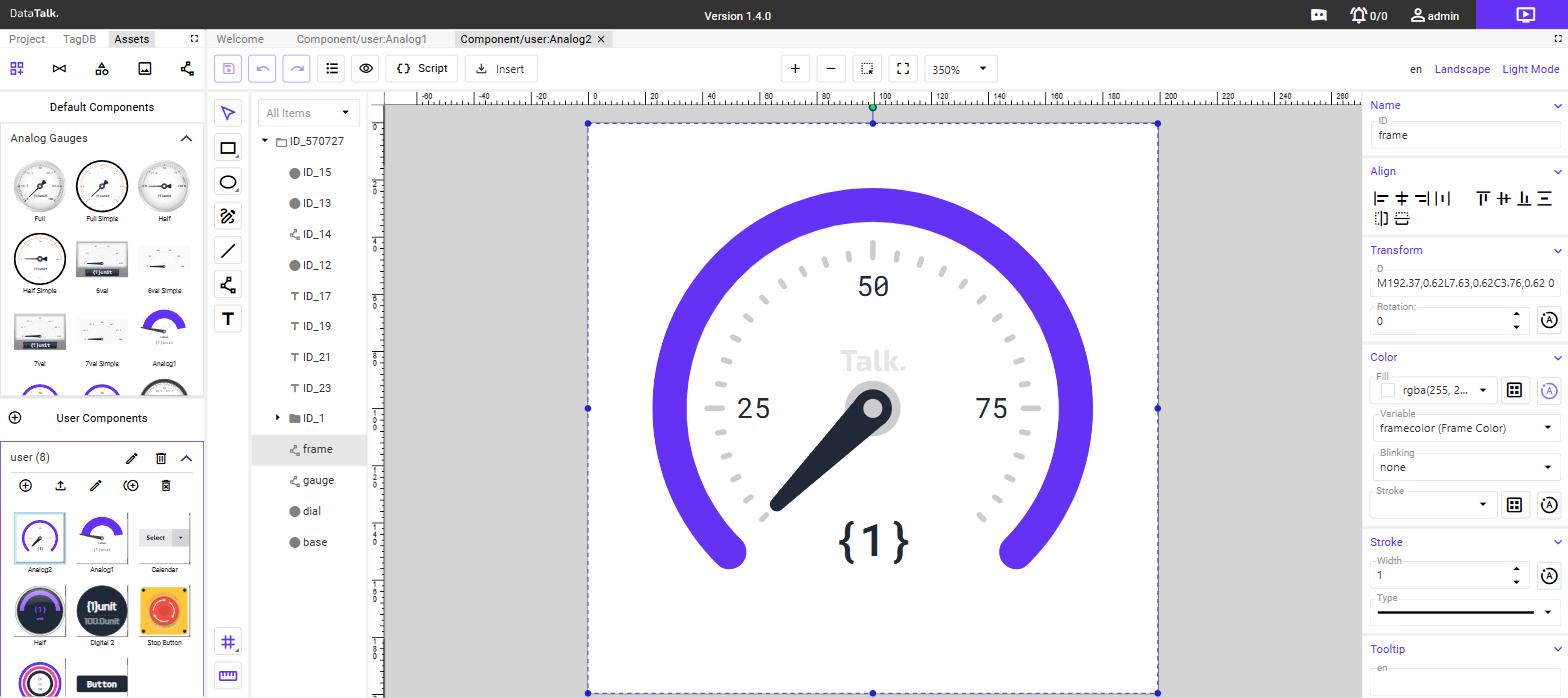
A freeform SVG path. The D field holds the raw SVG path data. Paths are also used to build rotating needles by binding the Rotation property to a tag variable through the Variable field.
| Path property | Purpose |
|---|---|
| D | SVG path data string |
| Variable | Component variable that drives the rotation of this path |
| Center ID | The ID (Name) of another element to use as the rotation pivot point |
| Range | The total rotation in degrees that corresponds to the variable’s full scale |
Text
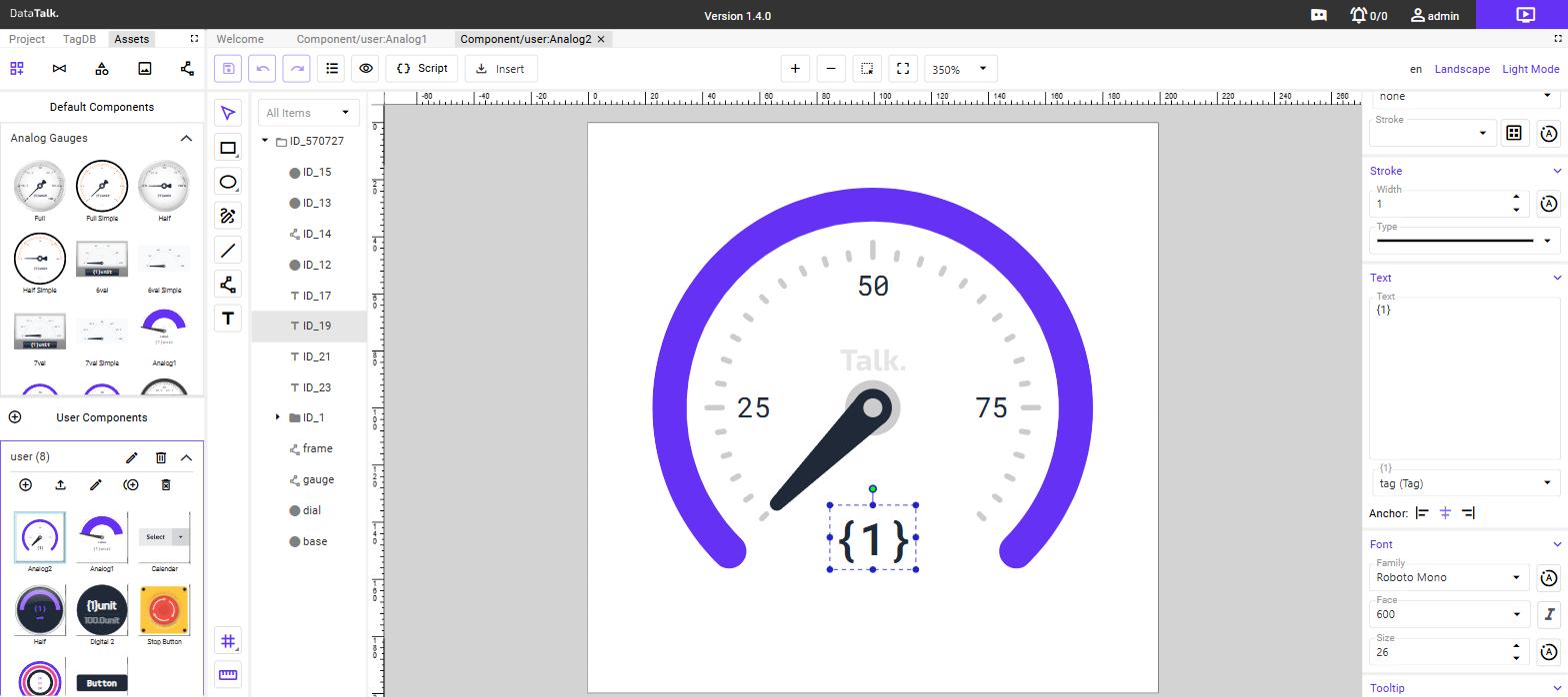
A text label. The content supports numbered placeholders ({1}, {2}, …) and tag property template expressions, letting you display live values and metadata directly in the component.
See Text placeholders and template expressions for the full syntax.
Group
A container that holds other elements. Groups let you move, rotate, and show/hide a set of elements as a unit. Components are typically structured as nested groups, with descriptive names such as frame, gauge, dial, or needle to keep the layer tree readable.
Line
A straight line segment. Useful for tick marks, dividers, and decorative rules.
Common element properties
Every element shares the following properties in the right panel.
Transform
| Property | Description |
|---|---|
| X / Y | Position of the element’s top-left corner on the canvas |
| W / H | Width and height |
| Rotation | Rotation angle in degrees around the element’s centre |
| CX / CY / R (circles) | Centre point and radius |
Each numeric field has an A (Animation) button beside it. Clicking A opens a variable selector that connects the property to a component variable — when the variable’s value changes (driven by live tag data), the property animates accordingly. See Animating properties with variables.
Color
| Property | Description |
|---|---|
| Fill | Fill color with opacity (RGBA picker) |
| Variable | Component variable (Color type) that drives the fill color |
| Blinking | Optional blink condition — the element pulses when the condition is met |
| Stroke | Outline color |
| Stroke Width | Line thickness in pixels |
| Stroke Type | Solid, dashed, or dotted |
Variable bindings work the same way across all property types — not just color. Depending on the element, you can link a variable to the fill color, text content, font family, font size, and more. Each binding type uses a dedicated field or button in the properties panel: the Variable field in the Color section links to a Color variable, the Font variable field links to a Font variable, the Font size variable field links to a Number variable, and the A (Animation) button next to any numeric property links to a Tag or Number variable that drives that property in real time.
Text element properties
In addition to the common properties, Text elements have a dedicated Text section:
| Property | Description |
|---|---|
| Content | The text string, including any {N} placeholders and ${…} expressions |
| Bound variable | Which component variable supplies the runtime value for {1} |
| Font family | The font used to render the text |
| Font variable | Component variable (Font type) that overrides the font family at runtime |
| Font style | Regular, bold, italic, and so on |
| Font size | Size in pixels |
| Font size variable | Component variable (Number type) that overrides the font size at runtime |
Visibility and opacity
| Property | Description |
|---|---|
| Visible | Toggle the element on or off. The A button links visibility to a component variable. |
| Opacity | 0–100 % transparency. The A button links opacity to a component variable. |
Tooltip
A text tooltip shown to the operator when they hover over the component on a live dashboard. Supports multiple languages — add a row per language using the language selector.
The variable system
Variables are the parameters that operators set when placing a custom component on a dashboard. Each variable has a name, a display label, and a type that determines what kind of value it holds.
When a user drops a component onto a dashboard canvas, a configuration panel opens listing all its variables. Variables primarily control the visual appearance of the component — colors, font families, font sizes, and numeric parameters such as scale factors. A variable of type Tag additionally links the component to a live data source, so the component reflects real-time values from the connected device.
Variable types
| Type | Used for |
|---|---|
| Tag | Connects the component to a live tag in the Tag Database. The tag’s current value, unit, name, and range are all accessible once a Tag variable is bound. |
| Color | Lets the operator choose a color that fills or styles an element. Linked to a fill via the Variable field in the Color section. |
| Number | A numeric parameter — typically font size, scale factor, or a threshold value. Linked to a property via its A button. |
| Font | A font family name. Linked to a text element’s font via the Font variable field in the Text section. |
Components that are entirely decorative (such as a status icon or a clock display) may have no variables at all — their appearance is fixed.
Example: dial gauge variables
| Variable name | Label | Type | Purpose |
|---|---|---|---|
tag | Tag | Tag | The live data source — drives the needle and the value display |
pointercolor | Pointer Color | Color | Fill color of the needle |
basecolor | Base Color | Color | Gauge background fill |
framecolor | Frame Color | Color | Outer frame fill |
dialcolor | Dial Color | Color | Dial face fill |
labeltextcolor | Label Text Color | Color | Color of the label text |
valuetextcolor | Value Text Color | Color | Color of the live value text |
labeltextsize | Label Text Size | Number | Font size for the label |
valuetextsize | Value Text Size | Number | Font size for the live value |
valuetextfont | Value Text Font | Font | Font family for the live value |
Example: digital display variables
| Variable name | Label | Type | Purpose |
|---|---|---|---|
tag | Tag | Tag | The live data source |
valtxtcolor | Value Text Color | Color | Color of the live value text |
valtxtfont | Value Text Font | Font | Font family for the live value |
valtxtsize | Value Text Size | Number | Font size for the live value |
maxtxtcolor | Max Text Color | Color | Color of the scale maximum text |
You define variables in the Variables section that appears in the properties panel when nothing is selected (click the canvas background). Add a row for each parameter you want to expose.
Text placeholders and template expressions
Text elements support two dynamic content mechanisms.
Numbered placeholders
Write {1}, {2}, {3}, and so on inside a Text element’s content field. Each placeholder is bound to a component variable in the text element’s property panel — at runtime the placeholder is replaced by that variable’s current value.
Example: A text element containing {1} bound to the tag (Tag) variable displays the tag’s current live value.
Tag property expressions
Write ${variableName.property} to read a field from the Tag Database for the tag that is bound to a variable. Available properties include:
| Expression | Resolves to |
|---|---|
${tag.unit} | Engineering unit configured for the tag — e.g. °C or bar |
${tag.name} | The tag’s name as it appears in the Tag Database |
${tag.range.1/1} | The maximum value of the tag’s configured range — e.g. 100.0 |
In the editor canvas the expression renders as a placeholder word (e.g. ${tag.unit} shows as unit) because no live tag is bound at design time. The actual value is substituted at runtime.
Combining both
You can mix placeholders and expressions freely in a single text element:
{1}${tag.unit}At runtime this renders as the live tag value followed immediately by its unit — for example, 42.5°C. The {1} is replaced by the numeric value and ${tag.unit} is replaced by the unit string from the Tag Database, with no space unless you add one explicitly.
Another common combination is the scale maximum display:
${tag.range.1/1}${tag.unit}This renders as the configured range maximum with its unit — for example, 100.0°C — and is used in digital displays to show the top of the measurement scale.
Animating properties with variables
The A (Animation) button next to any numeric property links that property to a component variable so it updates in real time as the tag value changes.
Typical use — rotating needle:
- Add a Path element shaped as a needle.
- In the Path properties, set Variable to the
tagvariable. - Set Center ID to the ID (Name field) of the element you want to use as the rotation pivot — for example, the centre of the dial face.
- Set Range to the total sweep in degrees the needle should travel across the tag’s configured min–max range.
At runtime, as the tag value changes, the path rotates from its start position through the defined range, creating a live animated gauge needle.
Other properties that can be animated:
- Fill color (via the Color Variable field — links to a Color variable)
- Visibility (show/hide an element based on a boolean tag)
- Opacity (fade elements in or out)
- X / Y position (move elements to reflect position data)
- Font size (scale text dynamically via a Number variable)
Importing SVG files
The Insert menu in the editor toolbar provides two SVG import options:
Insert SVG — adds the SVG file as a new element on the canvas without touching any existing elements. Use this to import a pre-drawn shape, icon, or diagram and then wire its properties to variables.
Replace SVG — replaces the entire canvas content with the imported SVG. Use this as a starting point when you have a finished graphical asset and want to add variable bindings and animations on top of it.
Saving and using a component
Changes are saved automatically as you work. To make the component available on dashboards, close the editor (navigate away or switch back to the Assets panel).
The component appears in the User Components section of the Assets panel under its group. Drag it onto any dashboard canvas to place it. The configuration panel that opens lists all variables you defined — bind each one to a tag or value, then click Save to start the live display.
Because a User Component is a named, shared object, updating the component in the editor updates every instance of it on every dashboard simultaneously. Make structural changes (adding elements, adding variables) in the editor; per-dashboard customisation happens through the variable bindings set when placing the component.