
Live Charts
Live Charts stream tag values in real time as they arrive from the connected device — ideal for active process monitoring.
On this page
A Live Chart shows real-time streaming data. Unlike historical Charts that query a database for past values, a Live Chart subscribes directly to incoming tag updates and renders each new value as it arrives from the connected device.
Live Charts are suited for scenarios where operators need to watch an active process in motion: monitoring a pump startup sequence, observing a temperature ramp-up, or watching for oscillations in a control loop.
Creating a live chart
In the left sidebar (Project mode), expand Visuals → Live Charts. Click once on the Live Charts node to select it and activate the + button.
Click +. Enter a name that reflects the process and time scale — for example, Pump Flow Realtime or Reactor Temp Live. Click Save. The live chart appears in the tree.
Double-click the live chart name. It opens in a new tab with the title Live Charts / YourChartName.
Select which tags to display. For each tag, set the line color and label. Then configure the update interval — how often the chart redraws with the latest incoming values.
Key settings
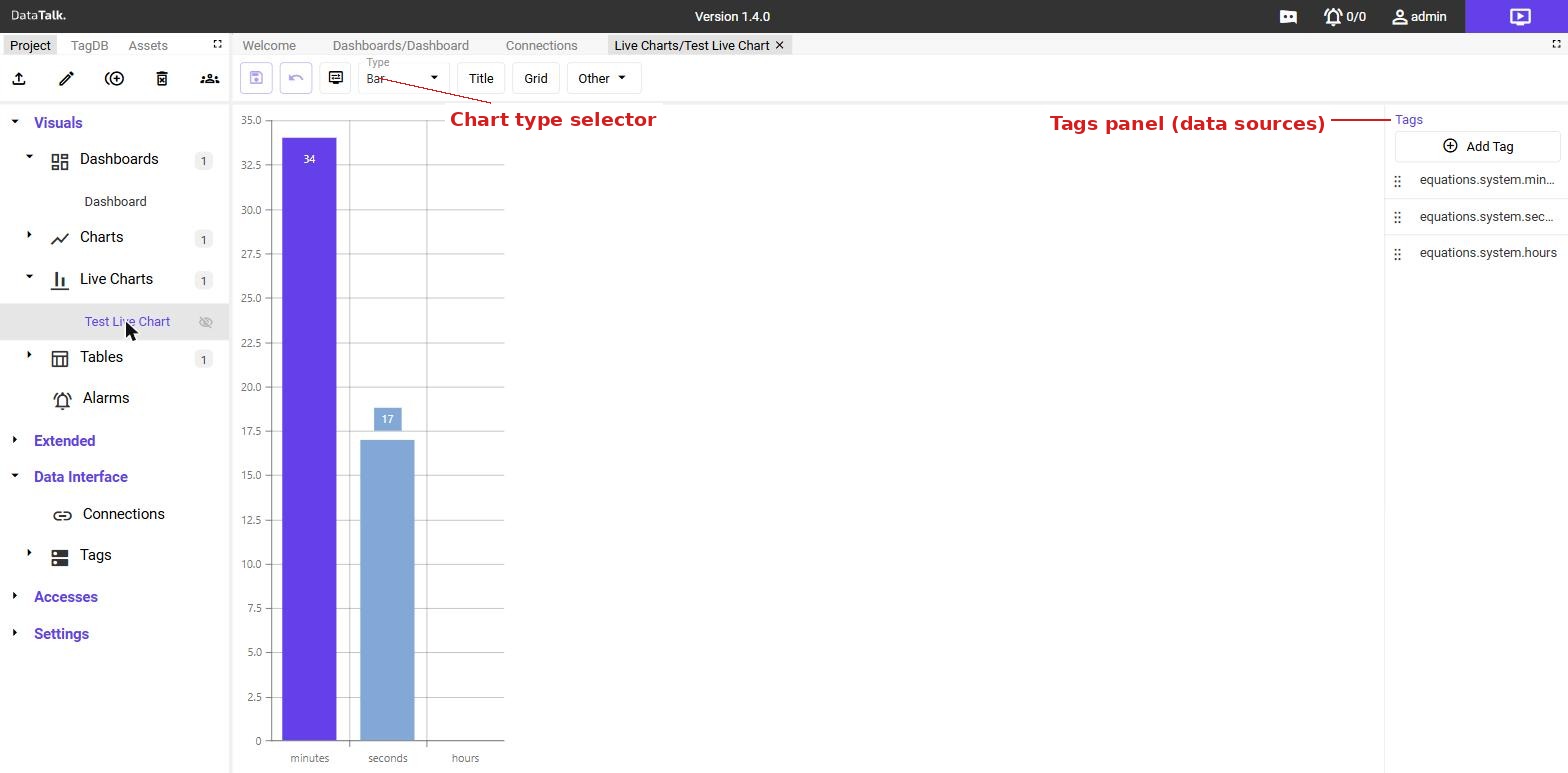
Tags — one or more tags from the Tag Database. Each tag becomes a series on the chart.
Update — automatic. The chart updates whenever a tag value changes — no polling interval to configure.
Aggregation — when the displayed time window is long enough that individual samples would overlap visually, the chart switches to aggregation automatically. Raw values are grouped into buckets and represented as averages (or min/max) so the chart remains readable without rendering thousands of overlapping points. No manual configuration is needed — aggregation turns on and off based on the current zoom level.
How Live Charts differ from Charts
Charts render a fixed or user-selected time range from historical storage. They show what happened. Live Charts stream incoming tag values as they arrive, showing what is happening right now. The two serve complementary purposes and are often placed together on the same dashboard — a Live Chart for the operator watching a running process, and a historical Chart for the engineer reviewing yesterday’s data.
Live Charts can be placed onto dashboards using the same drag-and-drop workflow as any other visual component. Drag the live chart from the Project tree onto the dashboard canvas, resize it, and it will begin streaming as soon as the dashboard is in view mode.