Charts
Charts are historical trend views that plot tag values over a selected time range. Create, configure, and reuse them across multiple dashboards.
On this page
A Chart is a historical trend visualization. It plots one or more tag values over a selected time range, letting operators and engineers review how a process variable has changed over minutes, hours, or days. Charts are configured once and can then be placed onto any number of dashboards.
Charts vs. Live Charts
It is important to understand the distinction between the two chart types:
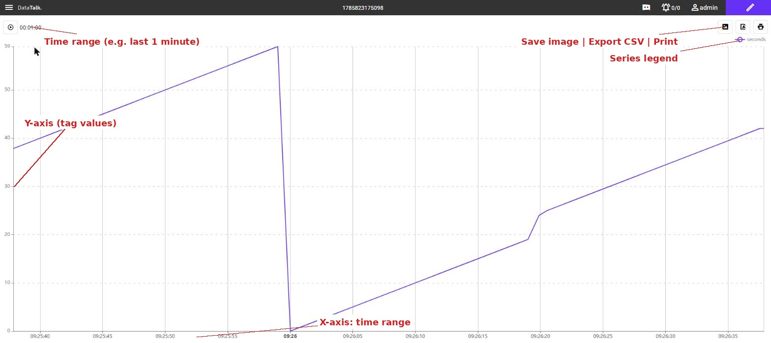
Charts — draw data from the historical database. The time range is configurable (last hour, last 24 hours, a custom date range). The chart renders a snapshot of past values and refreshes at a set interval. Use Charts for trend analysis, shift reviews, and performance reporting.
Live Charts — stream values in real time as they arrive from the device. Use Live Charts for active process monitoring where you need to see what is happening right now.
This page covers historical Charts. See Live Charts for the real-time variant.
Creating a chart
In the left sidebar (Project mode), expand Visuals → Charts. Click once on the Charts node to select it, making the + button active in the sidebar toolbar.
Click +. Enter a descriptive name for the chart — for example, Tank Level Trend or Motor Temperature 24h — then click Save. The chart appears in the tree.
Double-click the chart name. The chart editor opens in a new tab. The tab title reads Charts / YourChartName.
In the chart editor, add one or more data series. For each series, select the tag from the Tag Database that provides the values. Assign a label, color, and chart type (line, bar, or area) for each series. Multiple series can share the same Y axis or use separate axes for different units.
Choose the default time range (for example, last 1 hour, last 24 hours, or a fixed window). Set axis titles, enable or disable gridlines, and configure the tooltip behavior. Changes take effect immediately in the preview.
Chart toolbar actions
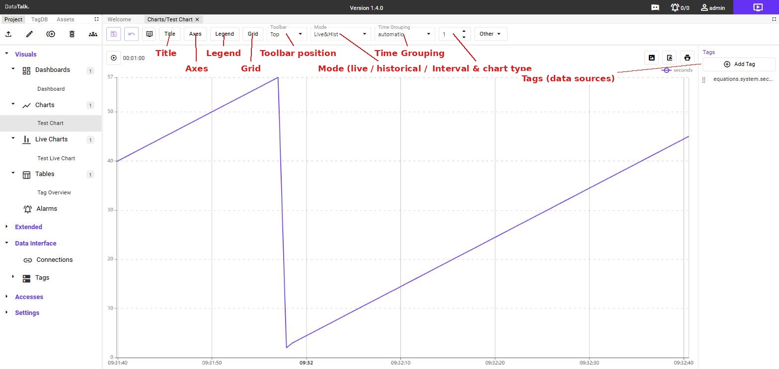
When a Charts tab is active in the editor, the toolbar provides:
Title — opens Title Settings: a checkbox to show or hide the chart title, and a text field to set the title text displayed above the chart.
Axes — opens Axes Settings: a list of Y-axes. For each axis you can configure visibility, color, autoscale (on/off), fixed Min/Max values, logarithmic scale, placement (left or right side), pane assignment (for split-pane charts), and an axis label. Use the + button to add a second Y-axis — useful when two tags have different units (e.g. °C and bar).
Legend — opens Legend Settings: toggle legend visibility and choose its position on the chart (top/bottom and left/center/right). The preview updates in real time.
Grid — opens Grid Settings: toggle the major grid on/off, enable or disable the Minor Grid (finer subdivisions), control horizontal and vertical lines independently, and set the grid color and opacity.
Toolbar — dropdown that sets where the chart’s own control bar (time range, export buttons) appears when the chart is viewed: Top or Bottom.
Mode — dropdown that determines which data the chart loads: Live&Hist shows both live streaming and historical data, Live shows only the current real-time stream, Hist shows only historical database records.
Time Grouping — dropdown that controls how data points are aggregated over time (e.g. automatic, fixed intervals). The adjacent number field sets the number of data points and the second dropdown selects the series display type (line, bar, area, step, etc.).
Upload / Export — import a chart configuration from a JSON file, or export the current chart for use on another system or as a backup.
Rename (pencil icon) — rename the chart. The new name is reflected in all dashboards where this chart is placed.
Refresh — reload the chart data from the server.
Delete (trash icon) — permanently remove the chart. If the chart is placed on dashboards, the chart tile on those dashboards becomes empty. This action cannot be undone.
Share / Users — control which users or groups can view this chart when it appears on a shared dashboard.
Reusing charts across dashboards
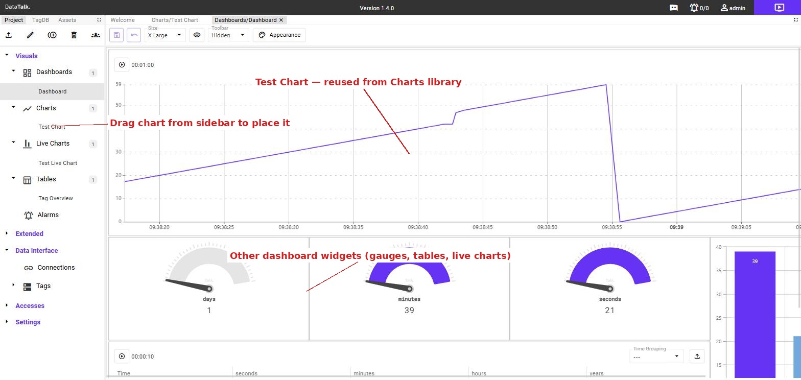
A chart is a named, reusable object. The same chart can appear on multiple dashboards simultaneously. When you update the chart configuration — change the tags, colors, or time range — the change is reflected everywhere the chart is placed.
This makes it practical to maintain a small library of standard charts (daily production trend, energy consumption, quality metrics) and compose dashboards by combining them, without duplicating configuration.
Use consistent names that include the data source and time window, such as Compressor_Pressure_1h or Boiler_Temp_7d. Clear names make it easier to find the right chart when building dashboards with many components.