
Assets — Components
On this page
The Assets panel is the component library for Real time Dashboards. Open the panel and drag any component onto an open dashboard canvas to add it to your layout.
Components in a Ranges group inherit alarm colours and limit thresholds automatically from the tag’s Ranges configuration. There is no per-component setup — bind the component to a tag that has Ranges defined and the correct zones appear instantly. Any change to the tag’s Ranges updates every component bound to it across all dashboards.
Opening the Assets panel
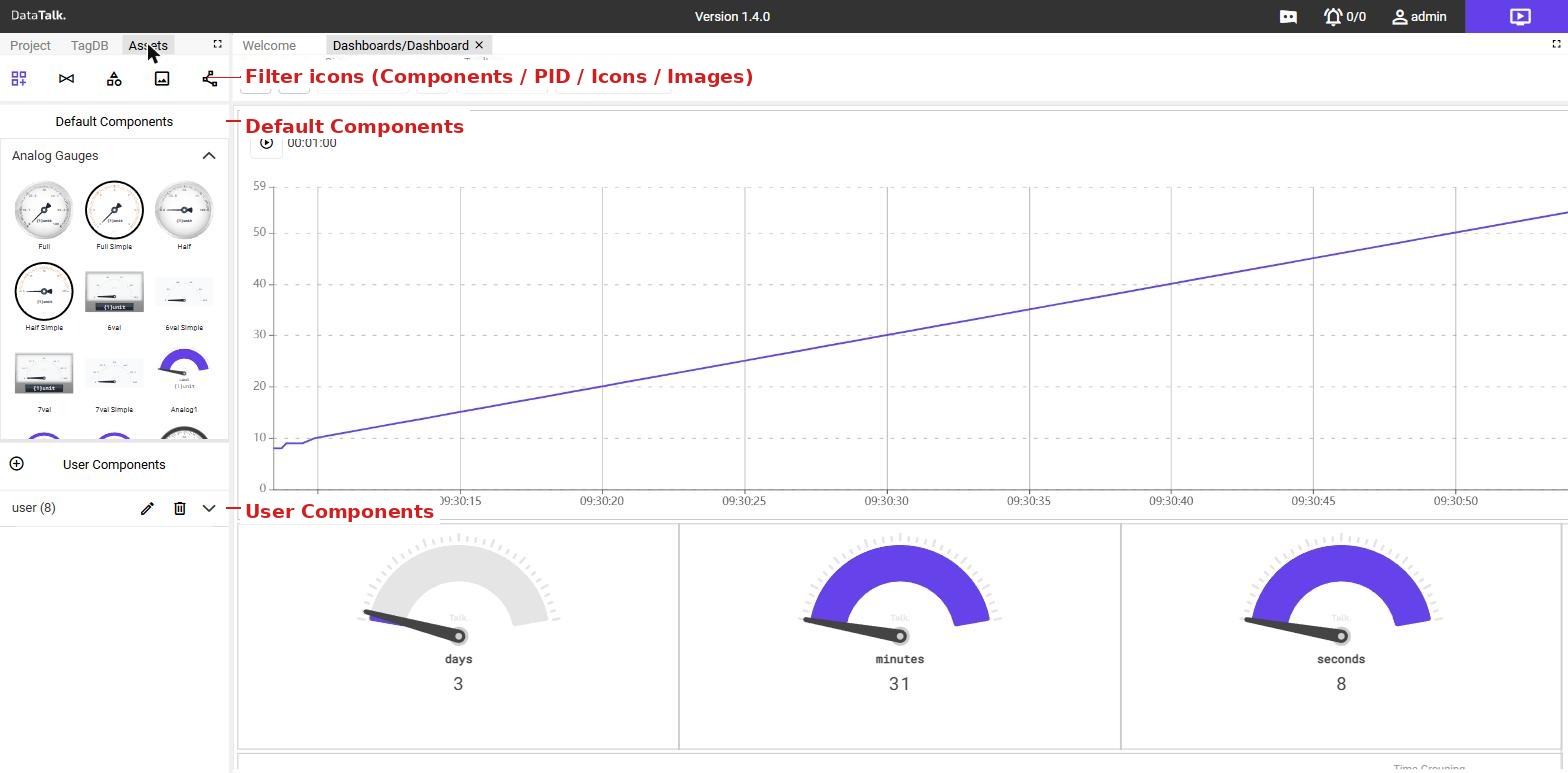
Click the Assets tab at the top of the left sidebar to switch from the Project tree to the component library. Five filter icons at the top of the panel control what is displayed:
| Filter | Shows |
|---|---|
| Components | Pre-built visual components — gauges, charts, indicators, and more |
| PID Diagrams | Piping and instrumentation diagram assets |
| Icons | Icon library for use on dashboards |
| Images | Uploaded image assets — backgrounds, diagrams, logos |
| User Components | Custom components built in the Component Editor |
| Component Editor | Custom component authoring interface |
Click Components (the first icon) to display the component library.
Default Components
All built-in components ship in the Default Components section, organised into named groups. Click any group name to expand it and reveal the components inside.
Most groups follow a consistent suffix convention — the suffix tells you exactly what a variant adds over the base design:
| Suffix | What it adds |
|---|---|
| (none — base) | Standard styling with full visual detail |
| Simple | Stripped borders and backgrounds for minimal, dense layouts |
| LightDark mode | Automatically switches face between light and dark based on the active application theme — no configuration needed |
| Ranges | Inherits alarm-zone colours and limit boundaries from the Ranges configured on the bound tag |
| Tag | Displays the tag name alongside the live value for quick identification on busy dashboards |
| S / M / L / XL | Size scale — pick the size that fits the available canvas space |
Component groups
| Group | What it displays or does | Sub-groups |
|---|---|---|
| Analog Gauges | Single numeric value on a round sweep-needle dial. Includes 270° full dials, 180° half-dials, compact 6- and 7-value multi-displays, three alternative face designs (Analog1–3), and a Thermometer variant. | LightDark mode · Ranges · Tag |
| Bars Horizontal | Numeric value as a proportional left-to-right fill bar. Available in thin or thick form, with or without a numeric label and optional icon. | Ranges · Tag |
| Bars Vertical | Same as horizontal bars but fills upward — well suited to level indicators such as tanks or silos. | Ranges · Tag |
| Buttons | Writes a value to a tag when pressed. Simple push buttons in four sizes. | Icon (icon on the button face) · Switch (latching toggle, writes opposite value on each press) |
| Date & Time | Time-related display and input: Calendar (monthly view), DateTimeBox (compact picker), Interval (elapsed duration), Range (dual-date window picker — drives chart/table time range), Toolbar (prev/next time navigation bar). | — |
| Digital Gauges | Numeric readout on a digital or LED-style display rather than a dial. Angled 45° formats, full-width accent-stripe displays, and a 3-value variant. | Ranges · Tag · Mode (shows a text state label instead of a number) |
| Displays | Flat rectangular value boxes in S–XL, plain or framed. The simplest way to show a live number on a dashboard. | Icon (1–3 values with a pictogram, horizontal or vertical) · Rounded (card-style with rounded corners) |
| Others | Specialised industrial widgets: Battery Level (fill icon for 0–100 %), Control Light / Control Light Label (boolean pilot light that changes colour), Stop Button (large process-stop button), Industrial Switch (tactile heavy-duty toggle). | — |
| Special | Layout container. StackFrame groups multiple child components into a single draggable unit so they move and resize as one. | — |
| UserInterface | Operator input controls: ComboBox (drop-down that writes the chosen option to a tag), ComboBoxArray (multi-select), TextBox (free-text input), LoginIcon and login name variants (display the current user’s identity on shared control-room dashboards). | — |
User Components
The User Components section shows every custom component built in the Component Editor and saved to the project. Components are organised into named groups you define yourself — for example, one group per production line or equipment type.
Expand a group — click the chevron next to the group name.
Rename a group — click the pencil icon.
Delete a group — click the trash icon. This removes the group and all components inside it permanently.
Placing a component on a dashboard
Open a dashboard in the editor, then drag any component from the Assets panel and drop it onto the canvas. A configuration panel opens on the right where you bind the component to a tag and set display options such as min/max values, unit labels, and decimal places.
Once dropped and configured, the component begins displaying live data immediately. Drag to reposition, pull corner handles to resize, and click at any time to reopen the property panel.