
Introduction
Real time Dashboards is a DataTalk module for building live, visual dashboards connected to industrial devices and IoT data sources.
Real time Dashboards is a DataTalk module that turns raw industrial data into interactive, visual dashboards — without writing a single line of code. It connects directly to the devices and data sources managed by the OT/IT Gateway, and lets you define exactly what data to display, in what form, and on which screen.
What you can do
Connect to live data — Real time Dashboards reads from the same data sources as the rest of DataTalk. Industrial devices (PLCs, meters, sensors), OPC UA servers, Modbus devices, MQTT feeds, SQL databases, and REST APIs all flow into the Tag Database. Once tags are available there, any dashboard component can subscribe to them.
Build charts and trend views — Create historical Charts to visualize how a value has changed over a selected time range, or Live Charts that stream the current value trend in real time as new data arrives from the field.
Create tabular data views — Tables let you display time-stamped records of tag values in a structured grid — useful for shift reports, audit logs, and troubleshooting data quality issues.
Compose dashboards with drag-and-drop — A Dashboard is a free-form canvas. You place charts, tables, live charts, alarm views, and visual Assets (analog gauges, digital displays, status indicators, and more) by dragging them from the sidebar or the Assets panel onto the canvas. Resize and reposition each component freely.
Use the Assets library — Assets is a built-in library of pre-built visual components: analog gauges, numeric displays, status lights, and other industrial-style widgets. You can also create and save your own reusable custom components to the library.
Monitor alarms alongside process data — The Alarms view within Visuals can be embedded directly on a dashboard, so operators see the active alarm list in the same screen as their live process values.
Editor overview
The editor is included in DataTalk Manager v1.4.0 and later. It opens as a web-based application accessible from any browser on the local network.
The editor is organized around three areas:
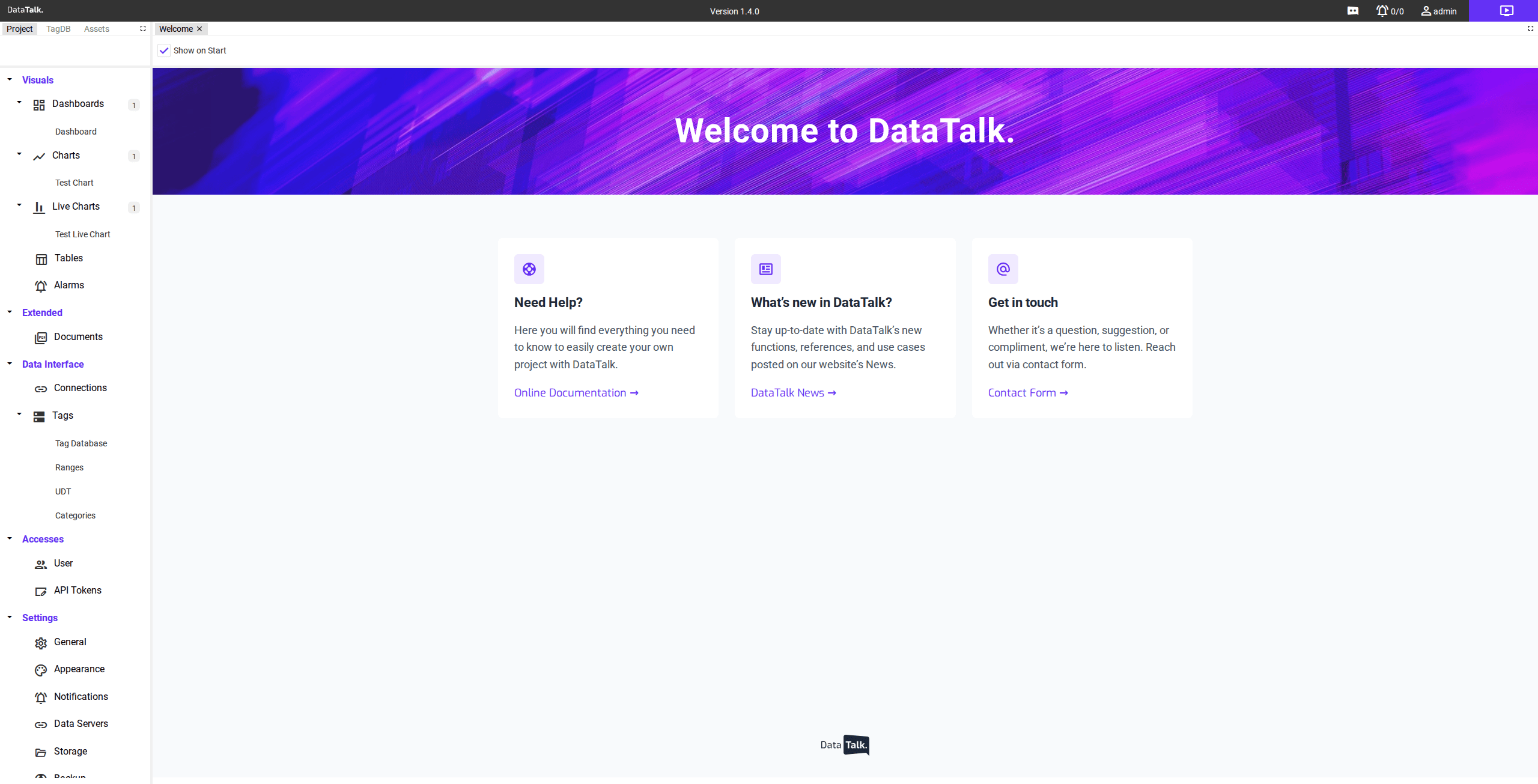
Left sidebar — switches between two modes. In Project mode it shows the full navigation tree (Visuals, Extended, Data Interface, Accesses, Settings). In Assets mode it shows the component library. A purple edit button in the top-right corner of the page toggles between view mode and editor mode.
Top tab bar — contains panel switchers (Project, TagDB, Assets) and shows open document tabs, one for each item you have opened for editing. Clicking a tab brings that editor to the front.
Toolbar — sits below the tab bar and shows context-sensitive actions for the currently active tab: upload/export, rename, refresh, delete, share, and mode-specific controls.
Main content area — the editor canvas. Each opened item (dashboard, chart, table) opens as its own tab here, similar to a code editor.
Main workflow
The typical flow for getting from zero to a working live dashboard is:
- Configure a Connection under Data Interface so the gateway can reach your devices.
- Import or map Tags in the Tag Database — these are the individual data points your visuals will subscribe to.
- Create Charts, Live Charts, or Tables under Visuals, and configure which tags each one displays.
- Create a Dashboard, then drag your charts and visual components onto its canvas.
- Switch to view mode to see the dashboard running live.
The sections that follow cover each of these steps and components in detail.