
Quick Start
Go from a fresh project to a working live dashboard in seven steps — connect a device, import tags, create a chart, build a dashboard, and switch to view mode.
This guide walks you through the complete flow from an empty project to a running live dashboard. It assumes DataTalk Manager v1.4.0 or later is installed and the Real time Dashboards module is licensed.
Navigate to your DataTalk device in a browser. The Real time Dashboards application opens in view mode by default.
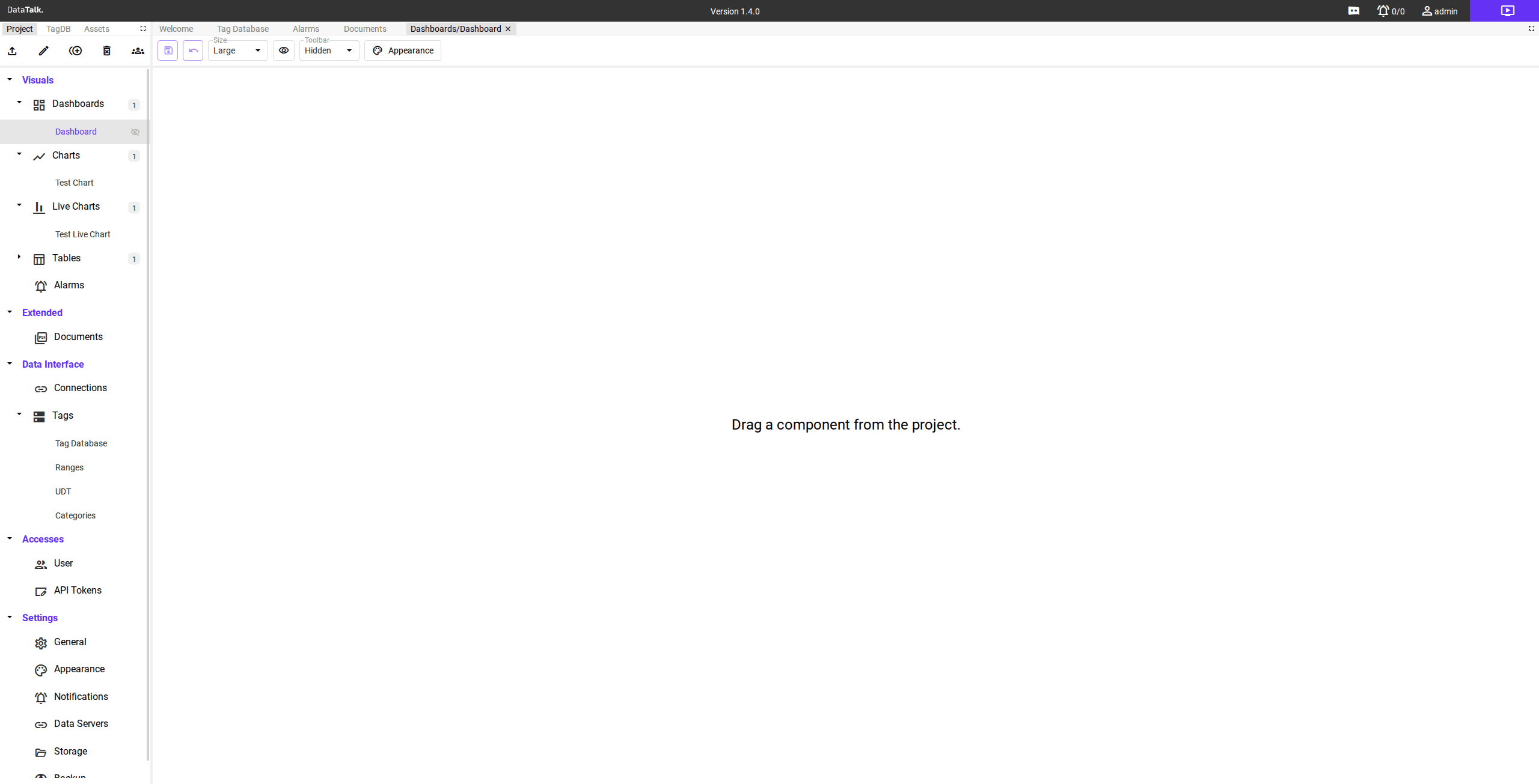
Click the purple edit button in the top-right corner of the page. The editor switches to edit mode — the left sidebar becomes active and the toolbar appears below the tab bar.
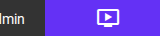
In the left sidebar, expand Data Interface → Connections. Click the + button in the sidebar toolbar to open the Add Connection dialog.
Select the protocol that matches your device (for example, Modbus TCP for most PLCs and meters, or OPC UA Client for OPC-enabled devices). Fill in the required parameters — IP address, port, and any device-specific settings — then give the connection a descriptive name such as Main_PLC or Energy_Meter_Hall_A. Click Save.
The gateway begins polling the device immediately. The connection tile turns green when the device responds successfully.
Use a Global / Local Memory connection to create virtual tags for testing your dashboard layout before real hardware is connected.
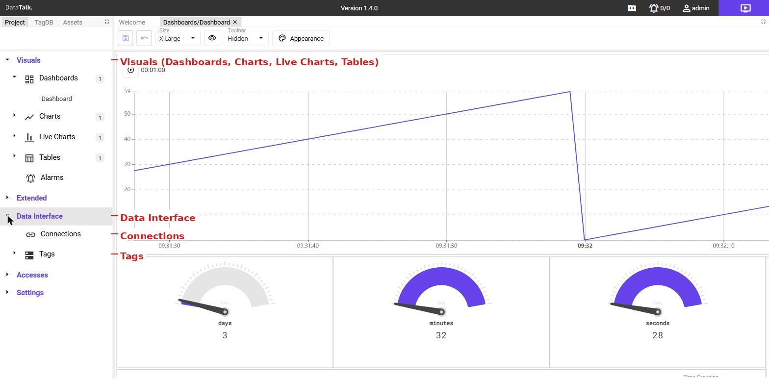
In the left sidebar, click TagDB in the top tab bar to open the Tag Database. Tags from your connected device appear here after a successful connection.
Review the available tags and confirm the data points you want to display on your dashboard are present and reading correctly. If tags are not visible, use the Refresh button in the toolbar to trigger a re-scan of the connection.
In the left sidebar, switch back to the Project tab. Expand Visuals → Charts. Click the + button in the sidebar toolbar.
A dialog prompts you for a name — enter something descriptive such as Pressure Trend — then click Save. The new chart appears in the tree under Charts.
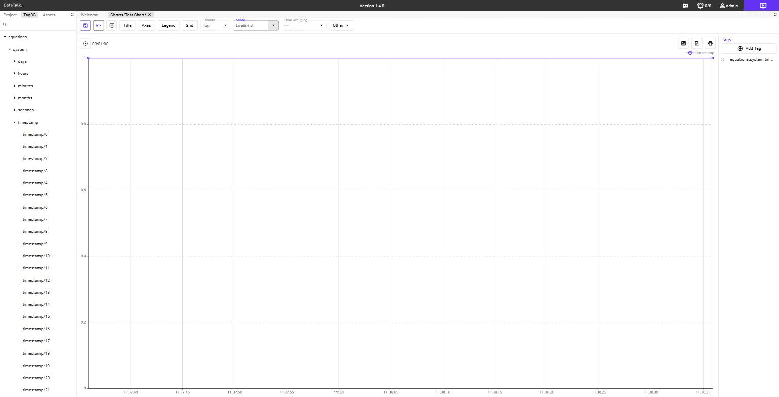
Double-click the chart name to open it in the editor. The chart editor tab opens. Configure the data series by selecting tags from the Tag Database, then set the time range, chart type (line, bar, or area), colors, and axis labels. Your changes save automatically as you work.
In the left sidebar, expand Visuals → Dashboards. Click the + button.
Enter a name for the dashboard (for example, Overview) and click Save. The dashboard appears in the tree. Double-click it to open the canvas in a new editor tab.
With the dashboard canvas open, find the chart you created in the Project tree on the left. Drag Pressure Trend from the sidebar tree onto the canvas and drop it where you want it to appear. The chart component appears on the canvas and can be resized by dragging its edges.
You can also switch the sidebar to Assets mode and drag pre-built visual components — such as analog gauges or status indicators — onto the canvas alongside your chart.
Click the purple edit button again to exit editor mode and return to view mode.
The dashboard now renders as a live display. Charts and gauges update in real time as data arrives from your connected device. Share the browser URL with operators — no login or special software required for view-only access.
Open the dashboard in the editor, then enable the Show on Start toggle in the toolbar. This dashboard will open automatically when users navigate to the application.