
Dashboards
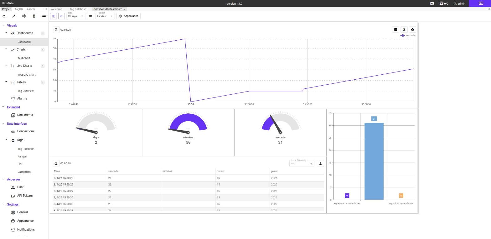
A Dashboard is a free-form canvas where you arrange charts, gauges, live charts, tables, alarm views, and other visual components into a live operator screen.
A Dashboard is the end result that operators interact with. It is a free-form canvas where you place, resize, and arrange visual components — charts, live charts, tables, alarm views, analog gauges, and any other element from the Assets library — into a coherent live display.
Dashboards are read-only for viewers in view mode. The drag-and-drop layout editor is only accessible in edit mode, making it safe to expose dashboards to operators without risking accidental changes.
Creating a dashboard
In the left sidebar (Project mode), expand Visuals → Dashboards. Click once on the Dashboards node to select it — the + button becomes active in the sidebar toolbar.
Click the + button. A dialog asks for a name. Enter a descriptive name such as Production Overview or Hall B Monitor, then click Save.
The dashboard appears in the tree under Dashboards.
Double-click the dashboard name in the sidebar. The dashboard canvas opens in a new tab in the main content area. The tab title shows the dashboard name.
Placing components onto the canvas
There are two sources of components you can add to a dashboard:
From the Project tree — switch the sidebar to Project mode. Expand Visuals and find the chart, live chart, or table you want to add. Drag its name from the sidebar onto the canvas. The component appears as a resizable tile.
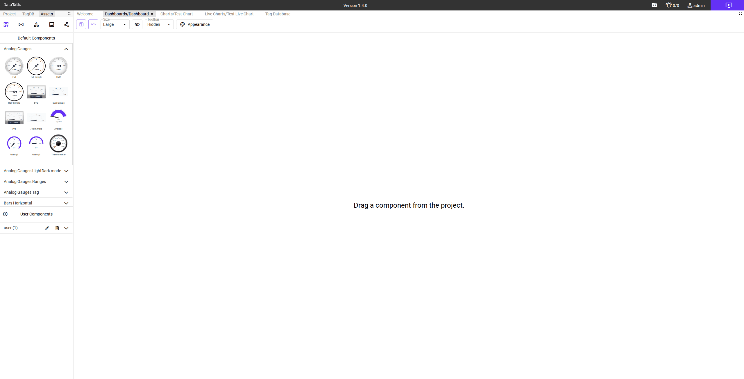
From the Assets panel — click the Assets tab in the top-left tab bar. The sidebar switches to the Assets library, which contains pre-built visual components: analog gauges, numeric displays, status lights, progress bars, and more. Drag any asset onto the canvas.
Once placed, components can be:
Moved — drag them to a new position on the canvas.
Resized — drag any edge or corner handle.
Configured — some components open a configuration panel when clicked, where you can bind them to a specific tag or adjust display settings.
Component selection controls
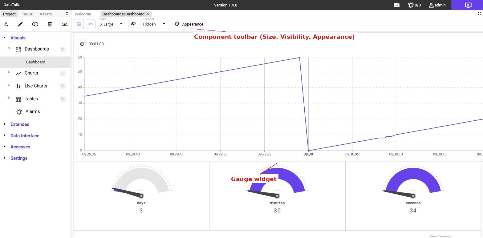
Clicking a component in edit mode selects it and switches the toolbar to show per-component controls:
Time — controls how this component’s time range is synchronised with the rest of the dashboard. Components can be linked to the global time control, linked to another specific component, or set to run independently.
- Global (default) — the component follows the dashboard-wide time selector. Panning or zooming on any globally-linked component shifts all other globally-linked components to the same window simultaneously.
- Dependent on another component — the component mirrors the time range of a chosen source component. For example, when an operator zooms into a particular hour on a chart, a linked table or second chart automatically narrows to that same hour.
- Independent — the component ignores both the global selector and other components, and uses its own configured time range. Use this when you need one panel to always show “last 5 minutes” while the rest of the dashboard shows a different range.
Visibility — controls which screen-size breakpoints the component is visible at. The dropdown lists four sizes: X Large, Large, Medium, and Small. When all four are checked, the field shows All. Uncheck a size to hide the component at that breakpoint — for example, hiding a large data table on Small screens to keep the layout usable on tablets.
Duplicate — creates an identical copy of the selected component on the canvas. The duplicate can then be moved, resized, and configured independently of the original.
Paste — pastes a component that was previously copied from this dashboard or another. Use this to reuse a component across dashboards without recreating it from scratch.
Delete (trash icon) — permanently removes the component from the canvas. This action cannot be undone.
Appearance — opens the Selected Item Appearance dialog. The dialog shows a box-model editor with three spacing layers — margin (space outside the component frame), border (the frame width itself), and padding (space between the frame and the component content) — each with numeric fields. An All checkbox on the border and padding layers applies the same value to all four sides at once. A Border Color picker sets the frame color. Click Save to apply the changes or Cancel to discard them.
Switching between edit and view mode
The purple edit button in the top-right corner of the page toggles between edit mode and view mode.
Edit mode — the toolbar, sidebar, and drag-and-drop controls are active. Components can be moved, resized, added, and deleted. Live data still flows but the focus is on layout.
View mode — the canvas renders as a clean live display. All editing controls are hidden. Components update in real time. This is the mode operators use during normal operation.
The URL of the dashboard in view mode can be bookmarked or shared directly. Operators can open it in any browser without needing editor access.
The URL includes a key parameter that identifies the current dashboard:
http://<device>/app/realtime/?key=<dashboard.id>Each dashboard has its own unique ID visible in the address bar when that dashboard is open. Copy the full URL — including ?key=… — to link directly to a specific dashboard.