
Chart Templates
Define reusable chart style presets — type, colors, line widths, axis configuration, and data series — that can be placed consistently in any report.
On this page
Chart Templates are reusable chart style presets that you define once and reference in any report template. Instead of configuring a chart’s type, colors, axis labels, and series for every report individually, a template captures all of that in one named object. When the report engine encounters a chart placeholder, it renders the chart using the settings stored in the referenced template.
Default templates
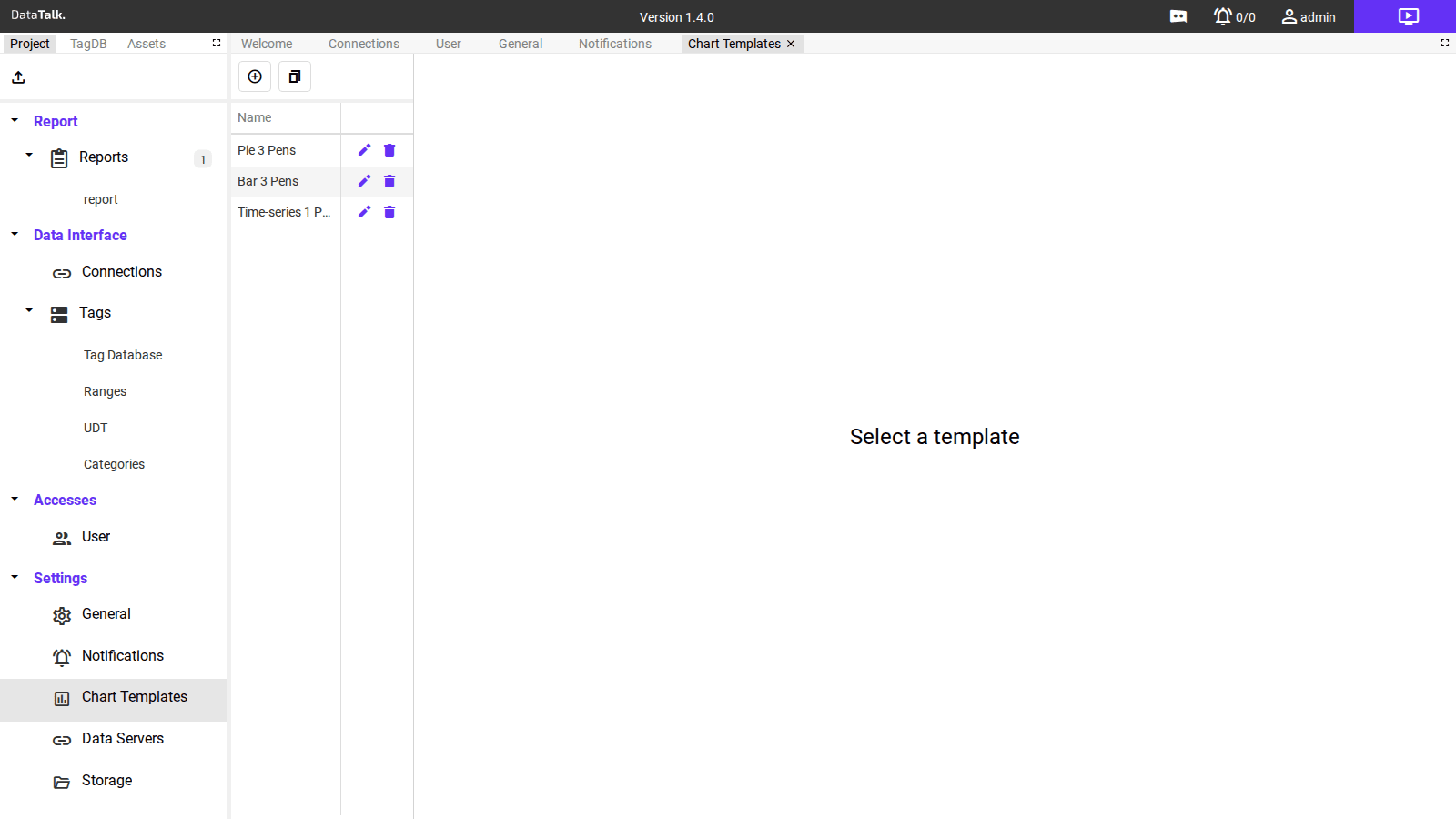
The application ships with three pre-configured templates as starting points:
Pie 3 Pens — a pie chart with three data series (Pen1, Pen2, Pen3) in blue, gold, and purple. Suited for showing share or distribution across three categories.
Bar 3 Pens — a vertical bar chart with three series side by side. Suited for comparing discrete values across three tags or categories.
Time-series 1 Pen — a smooth line chart with a time axis (X) and a single series. Suited for plotting a tag value over time.
Each template can be edited (pencil icon) or deleted (trash icon) from the list.
Chart types
The Chart Type dropdown in the template editor selects the chart style. Available types:
Time-Series — line chart with a date/time X-axis. Default for continuous sensor data trends.
Line — line chart with a numeric or categorical X-axis.
XY Line — scatter-line chart for plotting one numeric tag against another.
Time-Line — horizontal timeline / Gantt style for state-over-time visualization.
Bar — vertical bar chart for categorical comparisons.
Bar Array — grouped or stacked bar chart for multi-series bar data.
Pie — pie chart for proportional/share data.
Doughnut — doughnut chart (ring variant of pie).
Polar Area — polar area chart for circular comparative data.
Radar — radar/spider chart for multi-axis comparisons.
Scatter — scatter plot for correlation analysis.
Bubble — bubble chart (scatter with a third dimension encoded as bubble size).
Pie 3 Pens — example
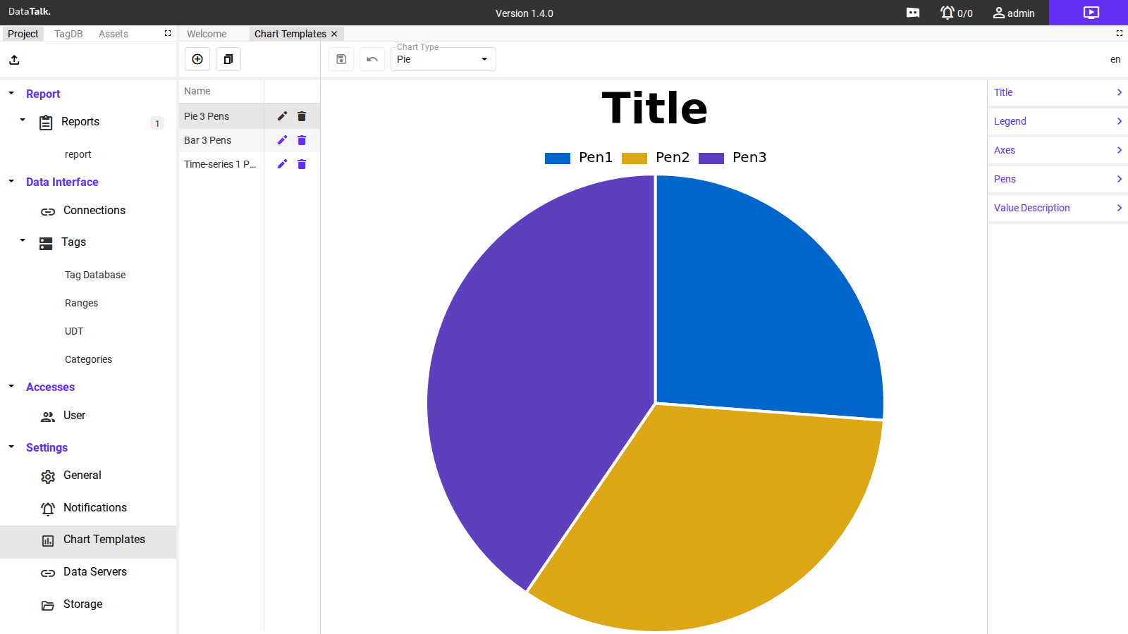
The pie chart preview shows the three segments (Pen1, Pen2, Pen3) with their configured colors. The right panel shows the available property sections: Title, Legend, Axes, Pens, Value Description.
Bar 3 Pens — example
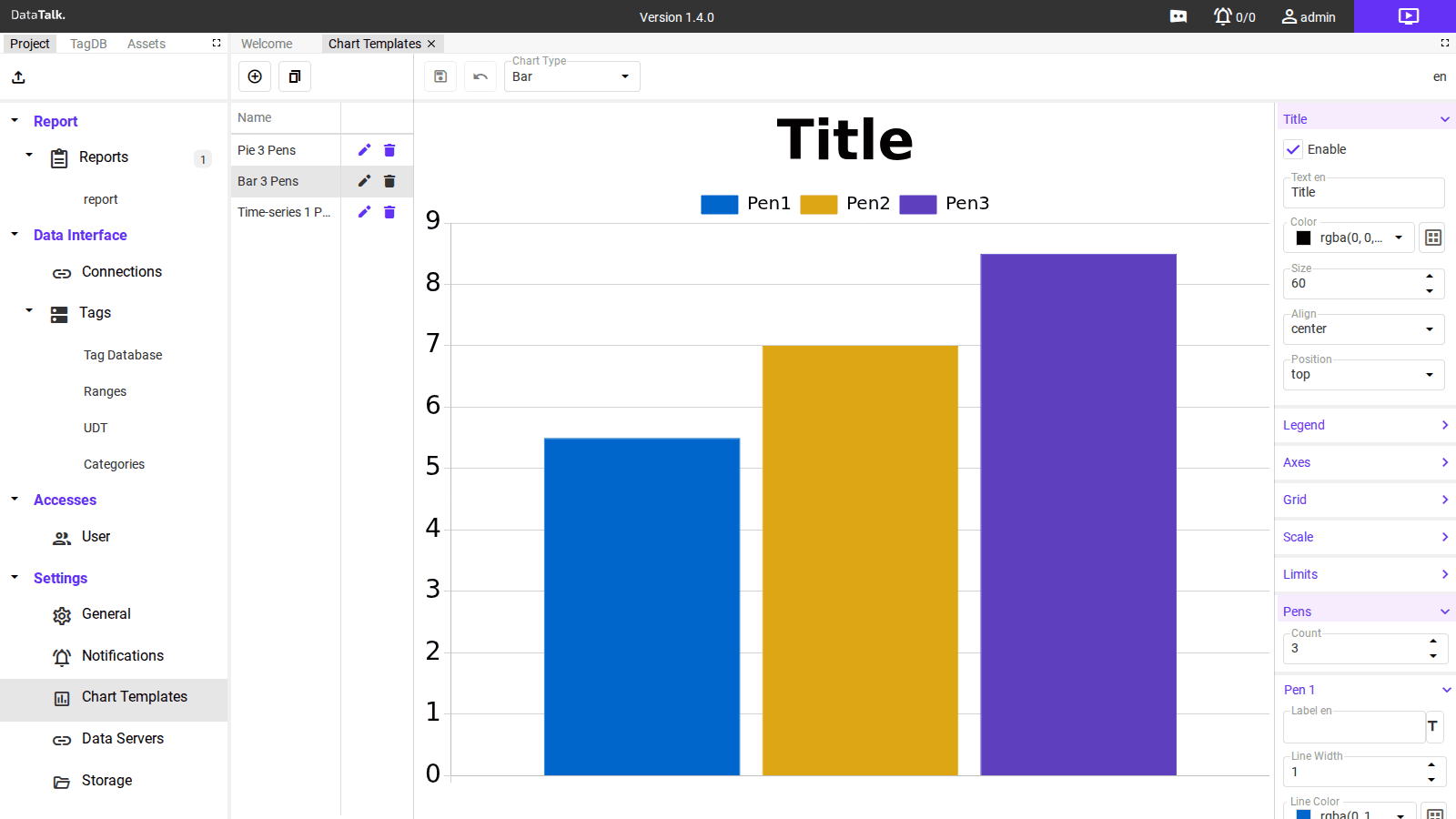
The bar chart preview shows three vertical bars in distinct colors. The right panel has the Title section expanded, showing all its configuration fields, and the Pens section expanded showing Pen 1 settings.
Time-series 1 Pen — example
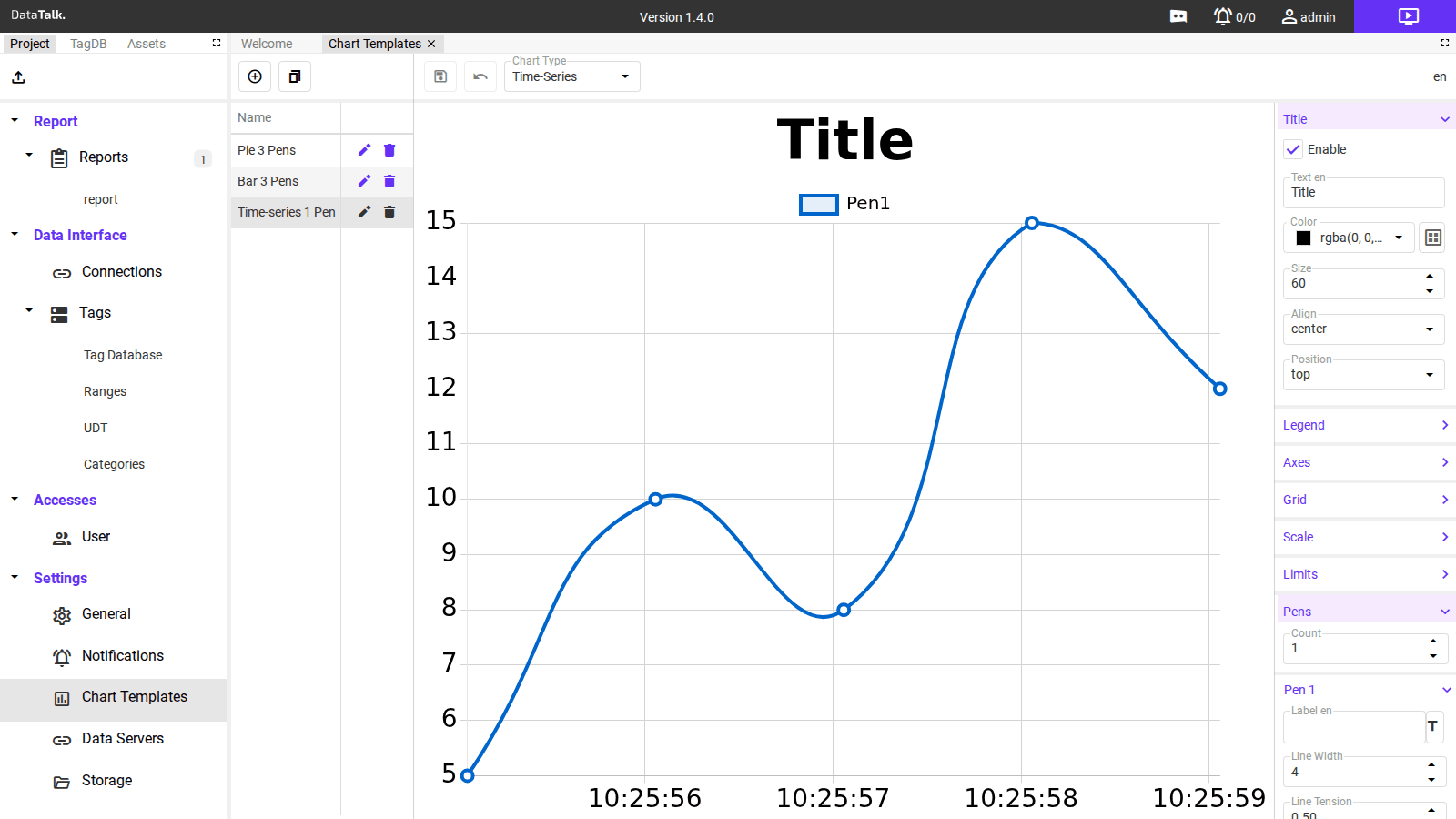
The time-series chart shows a smooth line with data points marked. The X-axis displays timestamps. The Pens section for a time-series pen includes an extra Line Tension field that controls curve smoothness (0 = straight segments, 1 = maximum smoothing).
Property panels
Each template’s properties are grouped in collapsible sections in the right panel. Click a section header to expand or collapse it.
Title
Controls the chart title displayed above the chart.
Enable — checkbox to show or hide the title.
Text — the title string (localizable; the en input sets the English text).
Color — the title text color, set as an rgba(r, g, b, a) value via the color picker.
Size — font size in points (default: 60).
Align — horizontal alignment of the title: left, center, or right.
Position — vertical position of the title relative to the chart: top or bottom.
Legend
Controls the chart legend (the color-labeled list of series names shown near the chart).
Configure legend visibility, position (top, bottom, left, right), alignment, and label font size.
Axes
Controls the X and Y axes. Applies to chart types that have axes (not Pie/Doughnut/Polar/Radar).
Configure axis labels, min/max range (fixed or auto-scale), tick formatting, and secondary Y-axis settings.
Grid
Controls the background grid lines drawn behind the chart data area.
Configure horizontal and vertical grid line visibility, color, and line style.
Scale
Controls value scaling on the Y-axis: min value, max value, and whether to auto-scale based on the data range.
Limits
Configures visual alarm/limit indicators — horizontal reference lines drawn at specific Y-axis values (e.g., a red line at the high-high limit of a pressure tag).
Pens
Defines the data series drawn on the chart. A “Pen” is one data series — one line, one bar group, or one pie segment.
Count — the number of pens in this template. Changing this adds or removes Pen N sections below.
The pen count defined in the template is fixed. If a chart template is configured for two pens, exactly two tag inputs must be assigned when the chart is used in a report. Assigning more or fewer inputs than the template defines will cause rendering issues. Always ensure the template’s pen count matches the number of data series you intend to display.
For each Pen N:
Label — the display name for this series in the legend (localizable; en sets the English label).
Line Width — thickness of the line or border in pixels.
Line Color — the series color as an rgba(r, g, b, a) value.
Line Tension (Time-Series and Line charts only) — controls curve smoothness. 0 draws straight segments between data points; 0.5 produces gentle curves; 1.0 produces maximum smoothing.
Value Description (Pie and Doughnut only)
Controls how values are displayed on or beside each pie/doughnut segment: percentage, absolute value, or both.
Creating and editing templates
Double-click Chart Templates in the Settings section of the nav tree.
Click the + (add) button above the template list. A new entry appears with default settings.
Use the Chart Type dropdown in the toolbar to select the chart style. The preview updates immediately.
Expand each section in the right panel and set the values for your reporting standard. At minimum, configure Title text, Pen count, and the color for each Pen.
Click the template name in the list and rename it to something descriptive — for example Temp_Trend_Daily, Energy_Bar_Weekly, or Flow_Pie_Shift. Engineers selecting templates in the report editor see this list.
Click the save (floppy disk) icon in the toolbar. The template is immediately available for use in report placeholders.
The three default templates (Pie 3 Pens, Bar 3 Pens, Time-series 1 Pen) cover the most common use cases. Rather than building from scratch, duplicate one of these and adjust the pen count and colors to match your reporting standard.
Create your chart templates before designing report layouts. This ensures every chart in every report uses the same axis ranges, colors, and line widths from the start — and avoids having to edit each report whenever the visual standard changes.
A chart template defines how the chart looks — type, colors, axes, series count. Which tags feed each pen and what time range to use are configured per-chart inside the report placeholder block (the History Chart or Live Chart block in the Charts category of the report editor). Changing a template updates the visual style across all reports that reference it without touching the data bindings.