
View Editor
The vector editor for views — canvas, drawing tools, layer tree, properties panel, preview, SVG import and the drawing elements you build screens from.
On this page
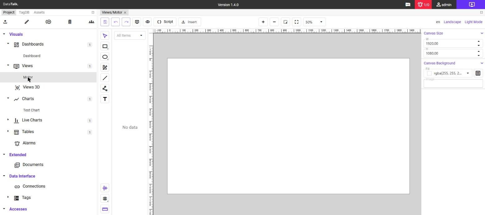
The View Editor is a vector drawing tool built into the application. It opens when you double-click a view in the Project tree and works like the Component Editor: you draw elements, and then wire their properties to live data.
Interface
| Area | Purpose |
|---|---|
| Toolbar (top) | Save, undo, redo, parameters, preview, script, insert SVG, zoom. |
| Drawing tools (left of the canvas) | Select and draw elements. |
| Layer tree | All elements of the view as a tree. Select elements, see their IDs, lock or hide them. |
| Canvas | The drawing surface with rulers. |
| Properties panel (right) | All settings of the selected element. With nothing selected it shows the canvas settings. |
Toolbar
| Button | Function |
|---|---|
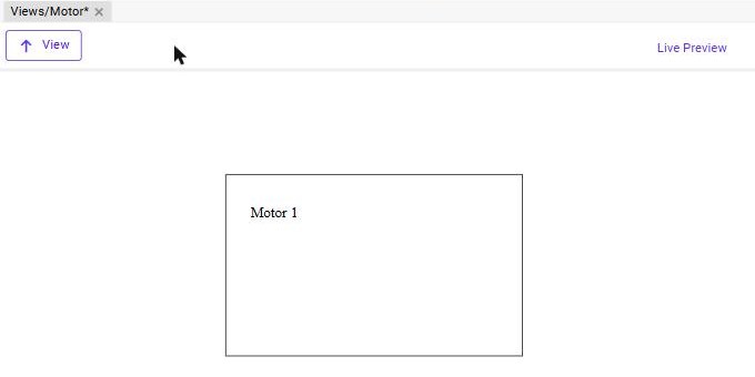
| Save | Saves the view. A view with unsaved changes is marked with * in its tab title (Views/Motor*). |
| Undo / Redo | Steps back and forward through your changes. |
| Parameters | Opens the Parameters and Filters dialog — see Parameters. |
| Preview (eye) | Shows the view as it will run, using the default parameter values. Click View to return to the editor. |
| Script | Opens the script editor of the view — see View Scripts. |
| Insert | Imports an SVG file — see Importing SVG. |
| + / − / zoom | Zoom the canvas in and out, fit it to the window, or pick a zoom level from the list. |
On the right side of the toolbar there are switches for the editing language (en), the orientation (Landscape / Portrait) and the color mode (Light Mode / Dark Mode). The label shows the current setting; click it to switch. In dark mode a Repaint link appears that redraws the canvas. Both are described in Mobile and tablet screens and Light and dark mode.
Canvas settings
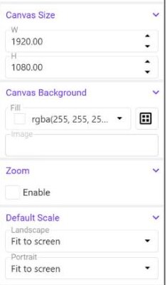
Click an empty area of the canvas to see the settings of the view itself:
- Canvas Size — W / H — the size of the drawing area in pixels. The default is 1920 × 1080. In view mode the canvas is scaled to fit the browser window.
- Canvas Background — Fill / Image — the background color and an optional background image.
- Zoom — Enable — lets the operator zoom into the view in view mode.
- Default Scale — Landscape / Portrait — how the view is fitted to the screen: Fit to screen, Full width or Full height. The two lists are independent, so a portrait view can fill the width while the landscape view fits the whole screen.
Layer tree
The layer tree lists every element under a root group. Hover over an item to see its lock and hide icons. Elements are named ID_1, ID_2… by default — rename them in the Name section of the properties panel. Meaningful IDs matter: the Center ID of a rotation animation and scripts refer to elements by their ID.
When elements overlap, or when the element you need is small or hidden behind others, select it in the layer tree instead of on the canvas.
Drawing elements
Select a tool in the toolbar on the left of the canvas, then click or drag on the canvas. The element appears in the layer tree and its properties open in the panel on the right.
| Tool | Element |
|---|---|
| Select | Selects, moves and resizes elements. |
| Rectangle | A rectangle with an optional Corner Radius. |
| Ellipse | An ellipse or circle, defined by its centre (CX / CY) and radii (RX / RY). |
| Edit path / Path | Freeform SVG paths and their nodes. |
| Line | A straight line. |
| Text | A text label, optionally with live values. |
The icons at the bottom of the tool column toggle guides, the grid and the rulers, which help with alignment.
Common properties
Every element has the following sections in the properties panel (text elements have a slightly different set):
| Section | Content |
|---|---|
| Name | The ID of the element. |
| Align | Buttons to align and distribute elements relative to each other. |
| Transform | Position and size — X / Y / W / H for rectangles, CX / CY / RX / RY for ellipses, X / Y for text — plus Rotation. |
| Color | Fill and Stroke colors (RGBA). |
| Stroke | Width and Type of the outline. |
| Tooltip | A text shown when the operator hovers over the element, one row per language. |
| Visibility | Visible and Opacity. |
| Set / Set Right Click / Set Mouse Down / Set Mouse Up | Commands that change tag values — see Set Commands. |
| Open | A command that opens another view or component — see Open Commands. |
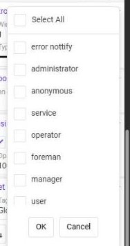
Next to many properties there is an A (Animation) button that binds the property to a tag — see Animations. The people icon next to Visible and the command sections restricts the element or the command to selected user groups.
Text elements
A text element has its own Text and Font sections:
| Property | Description |
|---|---|
| Text | The content. Can contain ${1} for view parameters and {1} placeholders for live tag values. |
| Anchor | Left, center or right alignment of the text around its X position. |
| Font — Family / Face / Size | The font, its style (regular, bold…) and size in pixels. |
Placeholders are described in Parameters and Animations.
If a text contains a {n} placeholder, the properties panel is rebuilt while you type. Enter or paste the whole text at once and check the result in the canvas.
Mobile and tablet screens: landscape and portrait
You draw a view once, on a landscape canvas (by default 1920 × 1080). For a phone or a narrow panel you can add a second, portrait layout of the same view — without creating a second view.
How the view chooses its layout. The application looks at the shape of the area in which the view is shown, not at the type of the device. An area that is taller than it is wide shows the portrait layout, a wider one shows the landscape layout. This also works on a PC: a narrow panel switches to portrait, and back to landscape when it becomes wider.
Creating the portrait layout
Click Landscape in the right part of the toolbar — the label changes to Portrait. The canvas turns upright and gets the size 1080 × 1920 (the landscape canvas turned by 90°). You can enter another size in Canvas Size.
Select an element and change its position, size, visibility or opacity in the properties panel. Everything you change now is stored only for the portrait layout; the landscape layout stays exactly as it was. Typical changes:
- place parts that are side by side in landscape one below the other,
- stretch panels to the full width of the narrow canvas,
- make texts and buttons bigger so that they are easy to touch,
- hide elements that are not needed on a phone — clear Visible in the Visibility section.
Click Portrait / Landscape to switch between them and check both. Then save the view.
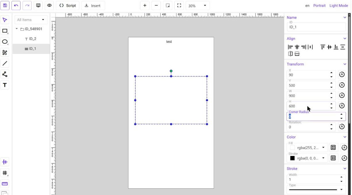
An element that you do not change in the portrait layout stays where it is drawn. On the narrower canvas it can end up outside the visible area — go through all elements, or hide those that are not needed.
Groups and symbols are moved as a whole: when you move a group, everything inside it moves too.
Light and dark mode
A view can look different in a light and in a dark environment. The operator switches between the modes in the application; in the editor you switch with Light Mode / Dark Mode in the toolbar.
You draw the view in light mode. Then switch to Dark Mode and set the dark colors:
- Elements — with an element selected in dark mode, the Fill and Stroke you change are stored for dark mode only. The light colors do not change.
- Canvas — click an empty area of the canvas and set Canvas Background — Fill in dark mode, for example a dark blue.
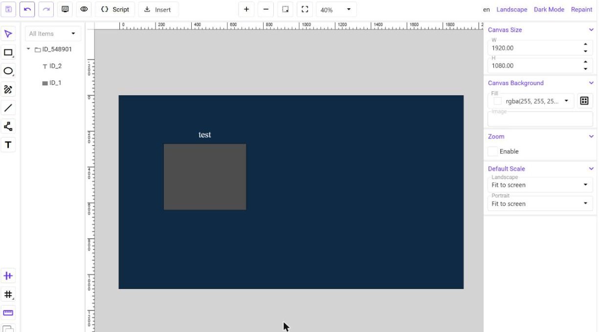
When you switch to dark mode, the editor suggests dark colors for all elements that do not have their own: light and dark shades are exchanged, medium tones stay. Always check the result and correct the colors that do not suit you — for example a text that became hard to read.
- Status colors — keep colors such as red for an alarm or green for OK recognizable in both modes. Animations that change a color (an alarm turning red) work in light and in dark mode.
- Gradients — a gradient is not converted automatically; set its dark version yourself.
- Colors from imported SVG — if an imported drawing does not switch in dark mode, redraw or recolor that element in the editor.
Components
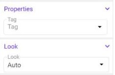
Components from the library (gauges, bars…) that have a dark version switch automatically. Components without a dark version look the same in both modes. In the properties of every inserted component, the Look list decides how the component follows the mode:
| Look | Meaning |
|---|---|
| Auto | Follows the mode of the view (default). |
| Inverse | The opposite of the mode — for example a dark panel on a light screen. |
| Light | Always light. |
| Dark | Always dark. |
Tips
- Give elements meaningful names (IDs) — they are easier to find in the layer tree when you adjust both layouts and both modes. Two elements should not have the same ID.
- Nothing needs to be installed or switched on: both features are part of the view and start working as soon as you set the first portrait position or the first dark color.
Importing SVG
The Insert button offers two options:
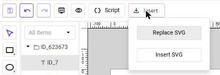
Insert SVG — adds an SVG file to the view as new elements and leaves the existing elements untouched. Use it to bring in a symbol, an icon or a diagram and then wire it to tags.
Replace SVG — replaces the entire content of the canvas with the imported SVG. Use it when you start from a finished graphic and add animations and commands on top.
Inserting symbols and components
Besides drawing, you can drag ready-made content onto the canvas:
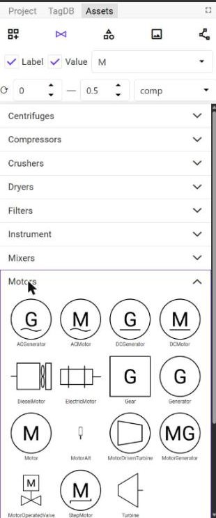
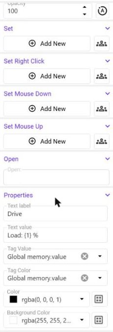
Symbols from the Assets tab — the P&ID library contains process symbols grouped by category (Motors, Pumps, Valves, Vessels…). Drag a symbol onto the canvas and fill in its Properties section: a text label, a text value with a {1} placeholder, and the tags that drive the value and the color.
Charts and other views — drag a chart (or another view) from the Project tree onto the canvas to embed it. A chart with Mode set to Live&Hist shows a running trend inside the view. See Tutorial — Reusable Motor Faceplate.
Saving
Click Save in the toolbar. Switching between edit and view mode closes the open editor tabs, so save before you leave edit mode.